

Safe [Classic] Fonts To Use and Why
Design is a complicated affair. The process of building a brand, especially designing a logo or word mark calls for juggling a variety of different responsibilities and variables at all once. A fundamental part of the design process is deciding what fonts to use; when to use, how to use it, and why.
For the uninitiated, a font is simply a set of letters and characters designed in a unique way to convey meaning and ensure understanding, most importantly optimum legibility. You want your messages to be understood and there’s no better way of doing that than choosing the right font type family.
You could design your own font, and often times creatives design their own fonts to compliment the classic fonts I would recommend you use. A classic font are those font families that have been tried, tested, and proven across thousands of design applications as long as the english language has existed.
Im biased as a creative, and i consistently highly recommend that my clients hire designers to build their logos and identity systems, but if one must do it yourself, these are the fonts I would recommend you use.
Why? Because they’re designed to communicate your messages the most effectively, and their timelessness will lend a maturity and class to your logo design that trendy and self-created fonts often cannot accomplish.
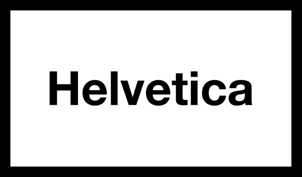
Helvetica, also known by its original name Neue Haas Grotesk, is a widely used sans-serif typeface developed in 1957 by Swiss typeface designer Max Miedinger and Eduard Hoffmann. Helvetica is a neo-grotesque design, one influenced by the famous 19th century typeface Akzidenz-Grotesk and other German and Swiss designs.
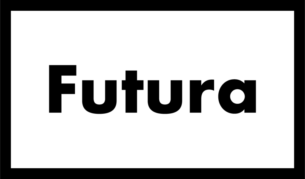
Futura is a geometric sans-serif typeface designed by Paul Renner and released in 1927. It was designed as a contribution on the New Frankfurt-project. It is based on geometric shapes, especially the circle, similar in spirit to the Bauhaus design style of the period
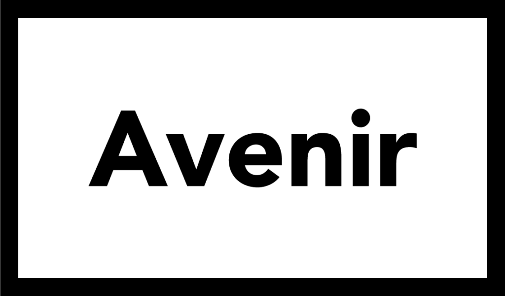
Avenir is a geometric sans-serif typeface designed by Adrian Frutiger in 1987[1] and released in 1988 by Linotype GmbH. The word avenir is French for “future”. As the name suggests, the family takes inspiration from the geometric style of sans-serif typeface developed in the 1920s
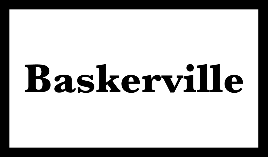
Baskerville is a serif typeface designed in the 1750s by John Baskerville (1706–1775) in Birmingham, England, and cut into metal by punchcutter John Handy. Baskerville is a transitional typeface, intended as a refinement of what are now called old-style typefaces of the period.
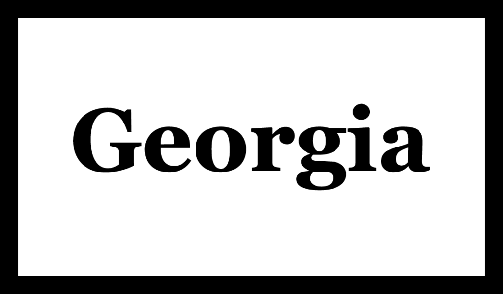
Georgia is a serif typeface designed in 1993 by Matthew Carter and hinted by Tom Rickner for the Microsoft Corporation. It was intended as a serif typeface that would appear elegant but legible when printed small or on low-resolution screens. The typeface is inspired by Scotch Roman designs of the 19th century and was based on designs for a print typeface on which Carter was working when contacted by Microsoft.
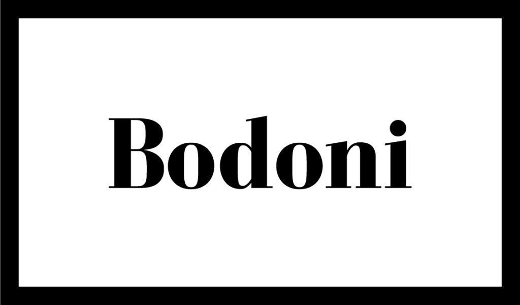
Bodoni is a serif typefaces first designed by Giambattista Bodoni (1740–1813) in the late eighteenth century. Bodoni’s typefaces are classified as Didone or modern. Bodoni followed the ideas of John Baskerville, as found in the printing type Baskerville—increased stroke contrast reflecting developing printing technology and a more vertical axis.
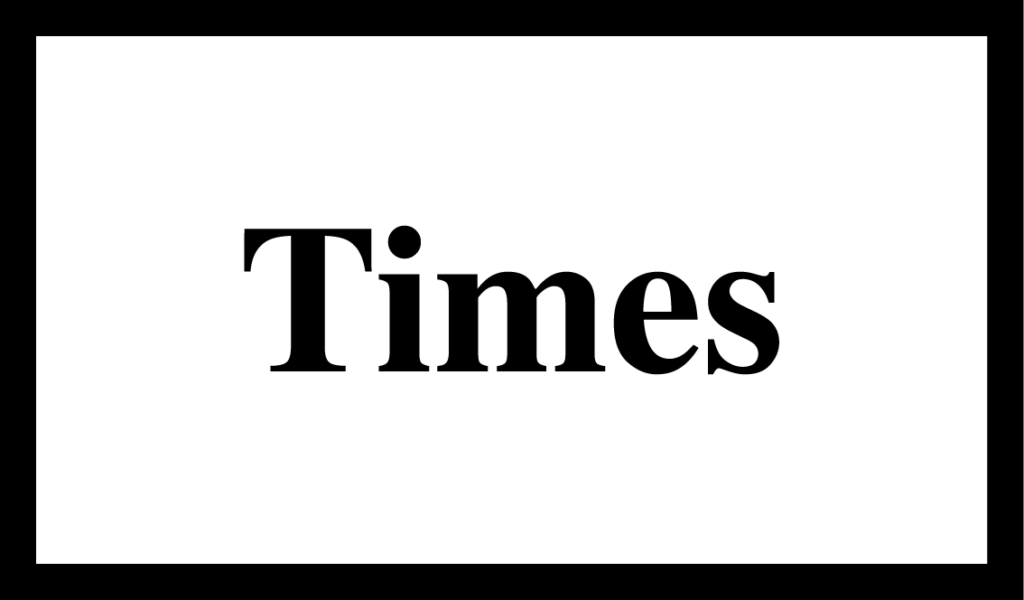
Times New Roman is a serif typeface. It was commissioned by the British newspaper The Times in 1931 and conceived by Stanley Morison, the artistic adviser to the British branch of the printing equipment company Monotype, in collaboration with Victor Lardent, a lettering artist in The Times’s advertising department. It has become one of the most popular typefaces of all time and is installed on most personal computers.
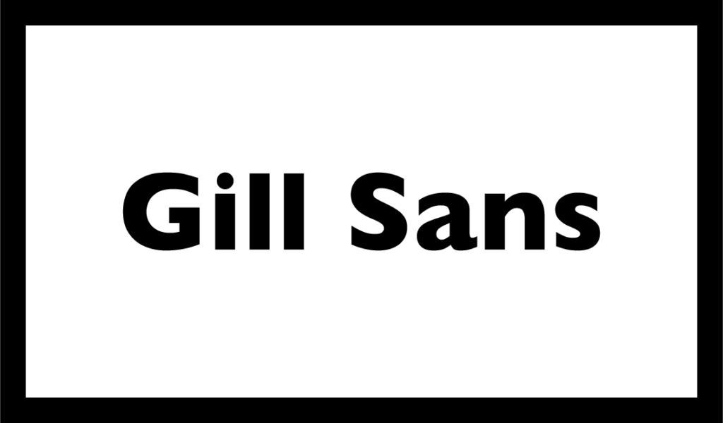
Gill Sans is a sans-serif typeface designed by Eric Gill and released by the British branch of Monotype from 1928. Gill Sans is based on Edward Johnston’s 1916 “Underground Alphabet”, the corporate font of London Underground. Gill assisted Johnston in its early development stages. In 1926, Douglas Cleverdon, a young printer-publisher, opened a bookshop in Bristol, and Gill painted a fascia for the shop for him in sans-serif capitals.
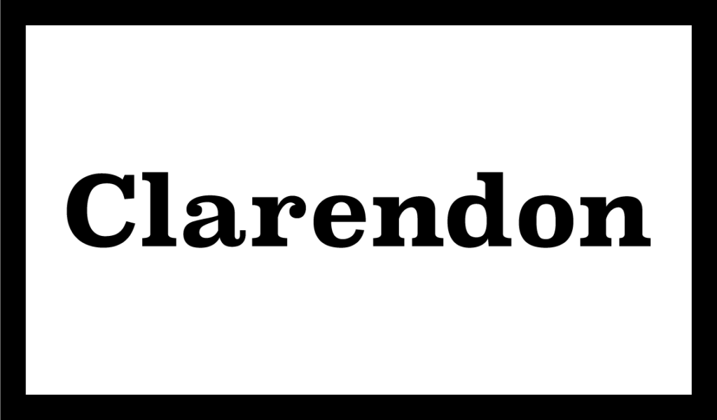
Clarendon is the name of a slab serif typeface that was released in 1845 by Thorowgood and Co. (or Thorowgood and Besley) of London, a letter foundry often known as the Fann Street Foundry. The original Clarendon design is credited to Robert Besley, a partner in the foundry, and was originally engraved by punchcutter Benjamin Fox, who may also have contributed to its design
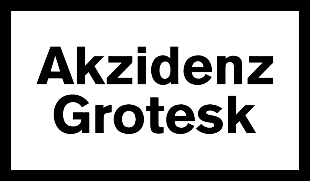
Akzidenz-Grotesk is a sans-serif typeface family originally released by the Berthold Type Foundry of Berlin. “Akzidenz” indicates its intended use as a typeface for commercial print runs such as publicity, tickets and forms, as opposed to fine printing, and “grotesque” was a standard name for sans-serif typefaces at the time
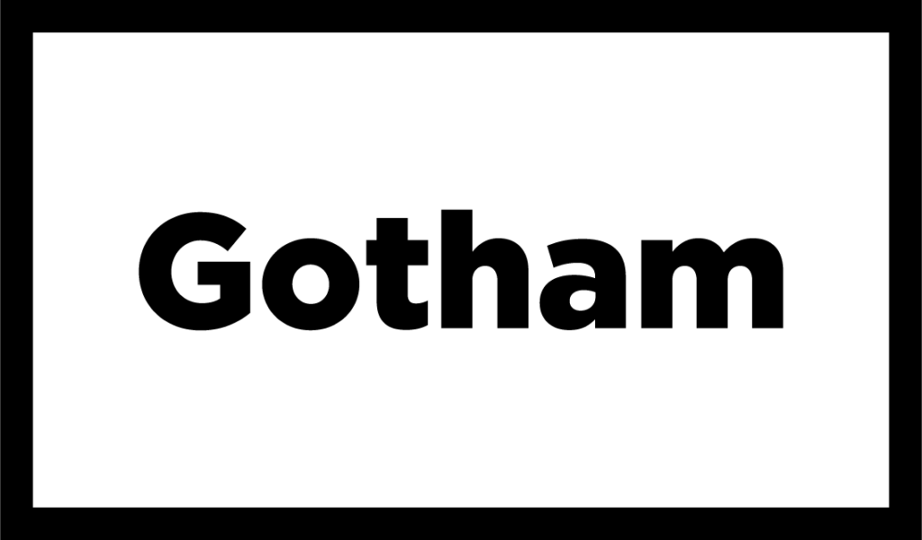
Gotham is a geometric sans-serif typeface family designed by American type designer Tobias Frere-Jones with Jesse Ragan and released through the Hoefler & Frere-Jones foundry from 2000. Gotham’s letterforms were inspired by examples of architectural signs of the mid-twentieth century.
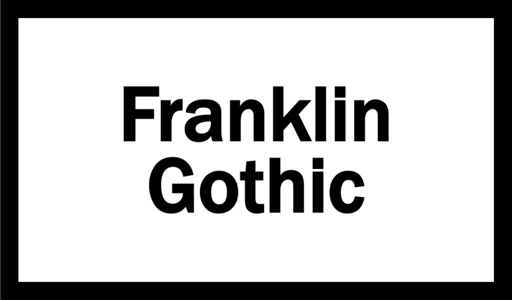
Franklin Gothic and its related faces are a large family of sans-serif typefaces in the industrial or grotesque style developed in the early years of the 20th century by the type foundry American Type Founders (ATF) and credited to its head designer Morris Fuller Benton.[1] “Gothic” was a contemporary term (now little-used except to describe period designs) meaning sans-serif.
Univers is a large sans-serif typeface family designed by Adrian Frutiger and released by his employer Deberny & Peignot in 1957. Classified as a neo-grotesque sans-serif, one based on the model of nineteenth-century German typefaces such as Akzidenz-Grotesk, it was notable for its range of weights and widths. The original marketing for Univers deliberately referenced the periodic table to emphasize its scope.
Comments are closed.